Reading is a cultural act. What we preserve in writing and pass on through reading is our cultural knowledge, whether it’s instructions on how to change a lightbulb or a lyric poem written in response to someone’s death. For more than half a millennium we have relied on printed books for transmission of culture, along with an ever-expanding cloud of printed ephemera.
In recent decades, our dissemination of written knowledge has expanded without the need for physical printing. But we’re still learning how to read the unprinted word; and the people who lay out pages for readers are just now figuring out how to present those words in an easy-to-read form. That form isn’t always the same as the ones developed for books, magazines, and other members of the print family.
As the late Bill Hill liked to say, “No one ever asked us to upgrade to Reading Version 2.0.” Bill Hill was the co-inventor, with Bert Keely, of ClearType, software developed at Microsoft (one of my former employers) to increase the apparent resolution of type, making letters onscreen appear sharper. “We tend to take reading for granted,” said Hill, “since we learn how to do it at about five years of age, and we continue to use the same basic technique for our whole lives.”
Read me a river
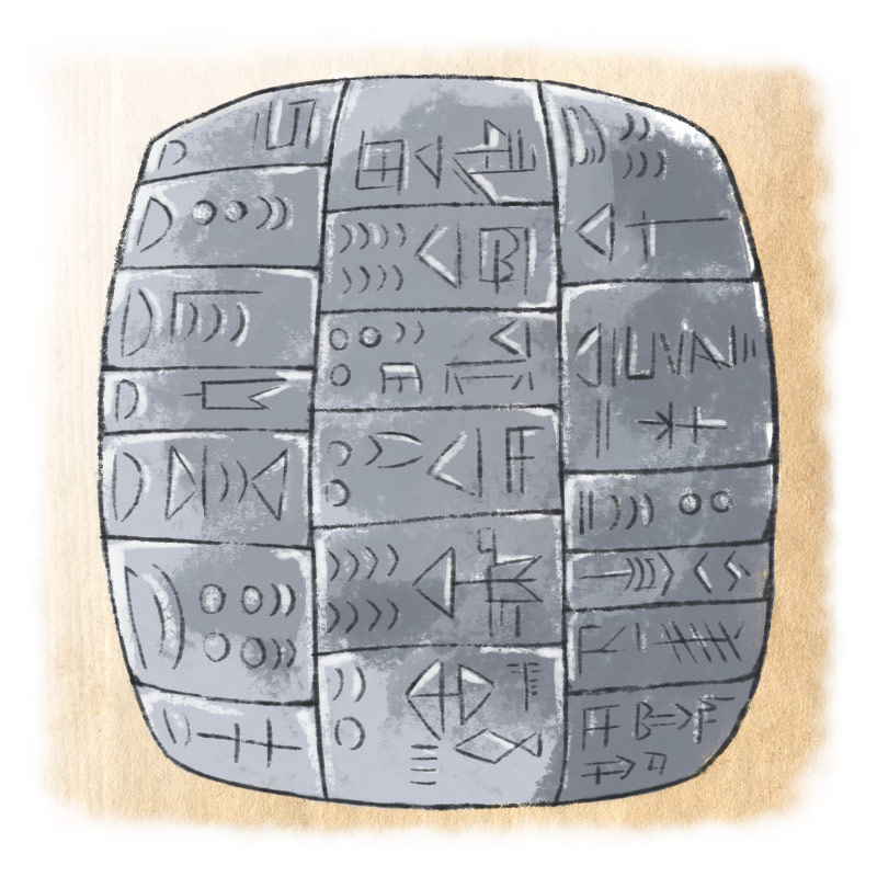
The mechanism of human reading hasn’t changed since we were puzzling out what shamans scratched onto tortoise shells or squinting at a bill of lading in cuneiform pressed into a clay tablet. Our eyes haven’t grown any bigger or shrunk any smaller, our arms still hold what we’re reading about the same distance from our eyes, and the size of the letters or other symbols that we’re comfortable reading for any length of time still falls within a narrow range.
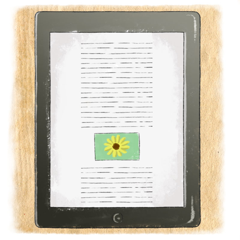
If you’re reading this on an iPhone or iPad, you see the result of a whole series of decisions about how to present these pages in iOS in an attractive and readable form. It’s a static page — scrollable, but otherwise unchanging, except that the lines break differently if you turn your device from a vertical position to a horizontal one. (Different choices were made for the Web, where there are more variables.)
The iOS app for The Magazine determines its articles’ typeface, set at a particular (but adjustable) size and with a particular amount of space between the lines. It also determines the margins around the text block, and all the other aspects of the appearance of the page.
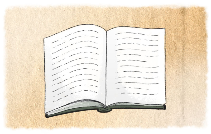
But what is a page? In a printed book, that’s an easy question to answer: the page is one side of a sheet of paper. Or more precisely, the surface of one of the sheets of paper that, when they’re folded, trimmed, and bound, make up the book. The content of that page — text, titles, illustrations, captions, whatever — has to fit somehow onto that surface. The essence of a book is a lot of pages, bound together, with text sprawling across those pages in sequence, page after page.
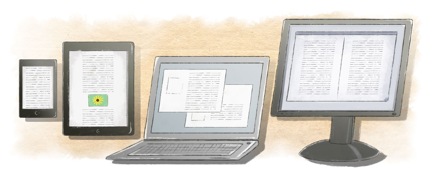
The same can be true on a screen (any kind of screen, from a phone to a home cinema). Just as you’d lay out a page of text to fit on the printed page, you can lay out a screen “page” of text to fit on the screen. If your book is going to be read on several different kinds of devices, you can design the pages differently for each device (an iPad screen, for instance, versus a Nexus 7). But that’s still a static format: one page to one screen.
Another approach is to think of the screen as just a window onto a large page: you scroll up or down or right or left to see other parts of the page. We think of this as unique to computer screens, but in fact it reflects the way books were often composed before the format we’re used to — separate sheets bound down one side — became common. (That is called the codex format. Not to be confused with a software codec.) With an ancient scroll, the reader held the two rolls of the scroll, one in each hand, and read the page that was displayed in between. (Unlike what we see in mock-medieval movies when a proclamation is being read, book scrolls were held horizontally, not vertically.)
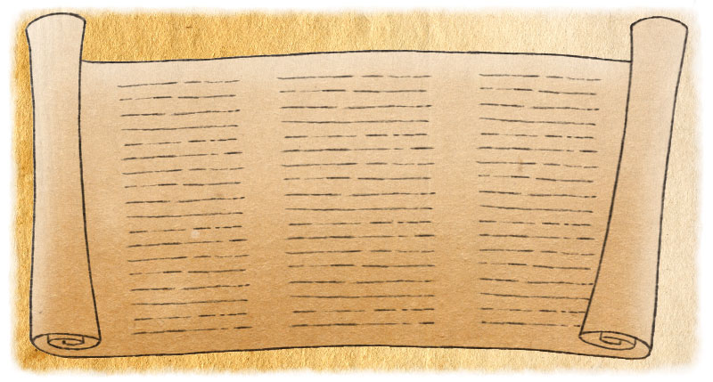
The “page” then was a block of text, written in relatively short lines and read, like a codex page, from top to bottom. The scroll was essentially a series of pages side by side, with the unseen pages rolled up on either side. The normal page of a scroll had lines noticeably shorter than a lot of our modern books, and the handwritten letters were usually larger than the printed letters we see today in, say, a newspaper or a mass-market paperback. But not by much.
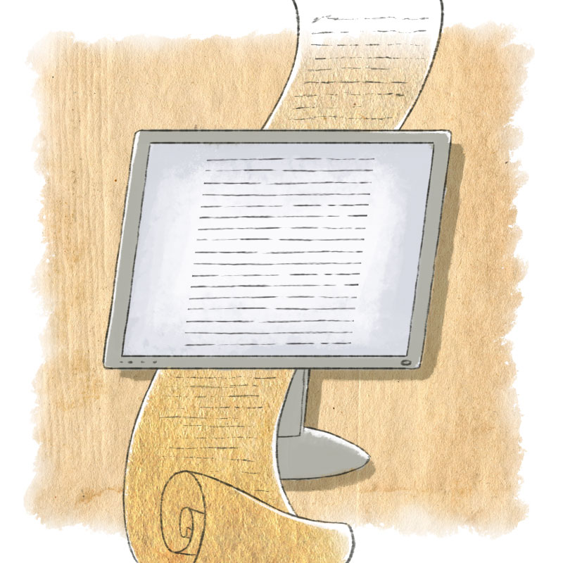
On a screen, the fundamental design question is whether to make the page larger than will fit on a single screen, so that you have to scroll down or sideways to read, or to design a page that fits exactly into the visible area of the screen. (With a real physical scroll, the motion of “scrolling” moved from one page to the next, not down a single long page.) What you’re reading right now in The Magazine takes the former tack; you have to scroll down to read the rest of this article.
Flex your pages
What if the screen size changes? Say you want to view the same book on your phone that you started reading on your laptop. Or the screen itself doesn’t change size, but you decide that the text would be easier to read if the font size were larger. Both of those situations require some kind of flexible layout that can adapt to the changed sizes or shapes.
That’s where digital book design is headed now. (Not to mention magazines, newspapers, and websites.) It’s been called adaptive or flexible or responsive layout, and those who like that sort of thing get into intense arguments about what each of these terms means. But the point is to design pages that will still look good when one of the size factors changes.
Unfortunately, we don’t yet have tools that are finely tuned for this degree of adaptation. Just as designers have been forced to make a choice in Web design for years already, would-be ebook typographers must select whether they want flexibility or precision. Page-layout applications like InDesign and QuarkXPress give us the tools to craft a carefully composed page, and those tools can automate a good deal of that process, if they’re used knowledgeably.1
For extended or immersive reading, where we’re reading a text that pulls us in, the length of the line becomes one of the most important design factors in how comfortable the text is to read. If the line is too long and the letters too small, it’s harder to read. There are other factors, too, like the amount of space between the lines, the space between the words, the tightness or looseness of letter-spacing, and the typeface used. They all interact.
The typographer’s job is to manipulate those variables to make a page that’s both inviting and readable. Of course, if we’re really motivated to read the text, we’re willing to put up with almost anything; when we’re bored with it, though, or find it difficult, that’s when the text needs all the help a typographer can give it.
Breathing room
Web design and other born-digital design has an unfortunate heritage of trying to cram as much information as possible onto one screen. The original reason for this was to avoid loading a new page from a Web server, CD-ROM drive, or other medium. In the old days of slow computers and slow Internet connections, you might have to wait an annoyingly long period before a new page would appear on your screen.
But that limitation is largely gone today: not only do Web pages load faster, but scripting can allow most of a Web page to remain static while replacing just components of the page. Often having more pages with less text on each one works much better for reading than a single, long, overcrowded one. The typographer can design each page for readable text without consideration for days long past.
A book of straight prose is the simplest to lay out, since it consists of continuous text with maybe a chapter title or a subhead now and then. The most complicated books to design, whether in print or for the screen, are textbooks, cookbooks, and art books, all of which usually have a variety of elements on each page that need to be coordinated visually and functionally. That’s hard enough to do on a static page; it gets much harder when you’re trying to design for a page that might change its size and shape, or the size of its text, so that not everything will still fit on the same page.
That’s when you get into a complex set of algorithms, a system of “If this, then that, and therefore the other,” to determine how text should be laid out, where illustrations and sidebars and notes should go, and whether some images or page elements need to be moved to another page altogether. All of this is done to serve the reader, to make reading the book a smooth, easy process where the reader never has to think about any of this design stuff, or even consciously notice it.
Without that complex system of flexible layout, and competent designers to use it, many ebooks have very awkward, hard-to-read page layouts. We’ve seen them all too often.
Page magic
What we need — and what, at least as of this week, doesn’t yet exist — is a detailed, rules-based system of adaptive layout that is not limited to any one platform or reading device. I call this “page H&J.”2 The really hard part is that, since the end result is malleable (changeable screen sizes and resolutions, changeable fonts and font sizes), the intelligence built into the H&J system has to be part of the reading software, not just the page-production software that creates the book. At least the reading device has to recognize and honor all the fine typographic controls that the designer has applied to the text.
While the current generation of ebook readers and ereader software can take an electronic document format like EPUB and render it into pages, the devices and programs all lack the sophistication to make a cascading series of choices that results in consistently good pages. The best of them compose mediocre pages with weak typography, and the worst produce a page that’s legible but hard to read.
The elements of a successful ebook design and production tool are several: H&J (as good as InDesign’s), the ability to do grid-based screen layout, media query (knowing the nature of the screen the book is being displayed on), keep & break controls (for deciding which elements of a page have to stay together and which can be divided or bumped entirely to another page), and what I call element query (giving each element on the page a way to know the nature of the other elements and the rules governing them). Simple, right?
I’ve been writing and speaking about this for the last couple of years, trying to goose the publishing and software industries into rising to the challenge. It will take a commitment of resources to excellence in publishing, not just to market dominance. And it will take thinking beyond that peculiar marketing bubble that each software company calls its “ecosystem.”
But it’s truly important to do this, and to do it now. It’s not too much to say that this is important to human culture. We’re at a pivot point, the start of a sea change, and whatever standards we set today are the ones we’ll be living with — and reading by — for a long time to come.
As a much-quoted Latin aphorism has it, littera scripta manet: the written word remains. It will certainly help if those words are designed to be read.
Illustrations by Sara Pocock.3
-
Even in print, there are absurd inconsistencies in the software. Adobe, for instance, felt for years that creative typographers wouldn’t care about automating production, and that production typesetters would be content without fine creative control. So they gave us two separate products for these ostensibly separate purposes. Happily, this isn’t a choice we have to make so often these days. ↩
-
In digital typesetting, “H&J” is short for hyphenation and justification, the complex system of algorithms that a page-layout application uses to determine where and how to break the lines. This includes the rules for where and when to hyphenate words. ↩
-
Sara Pocock is an animator and illustrator based out of Los Angeles, California. Her work may be found at http://sarapocock.tumblr.com/. ↩
John D. Berry is a typographer, book designer, design writer, and typographic consultant who speaks frequently on typography and design. He is the former Editor & Publisher of U&lc (Upper & lower case), and worked on the Fonts team at Microsoft. He is President of ATypI (Association Typographique Internationale).